Every year, color authorities such as Pantone, Sherwin Williams, Benjamin Moore, and Behr share their new “colors of the year.” These hues both reflect current trends and set the stage for the new colors’ growing popularity across interior and exterior decor, as well as impact color use from fashion to technology.
While each new color forecast gives us exciting options to consider, we can review color predictions for past years and see which hues had lasting impact, how they might have changed over the years, and/or what’s breaking norms.
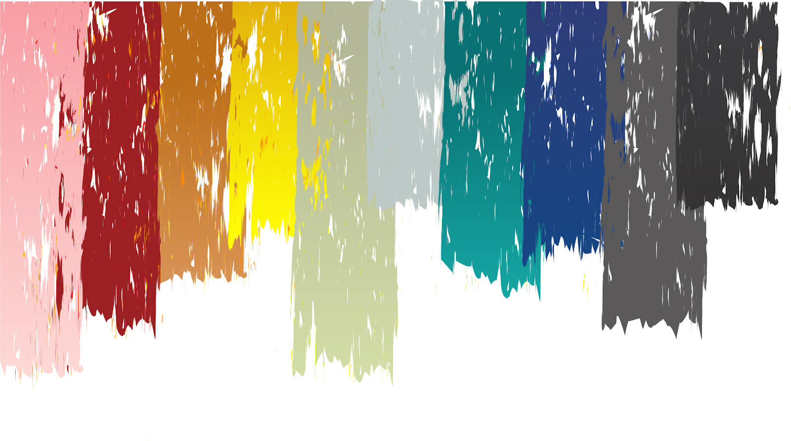
For National Tile Day, Why Tile examined the annual color picks from the last five years. By reviewing these recent color favorites, we discovered an ultimate rainbow pallet—from pale pinks to soft blacks. These are the 10 colors defying “trends” to become lasting favorites that compliment our lifestyle preferences.
Deap Teals
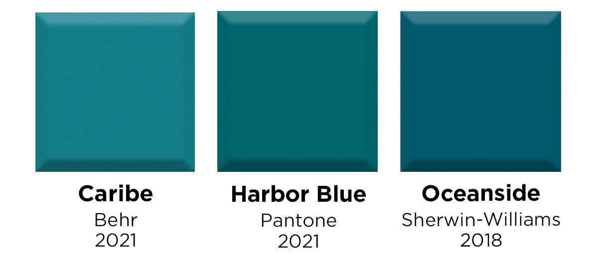
Strong blues have enjoyed a steady rise in popularity over the last five years. Deep teals contribute jewel tones to the blue family with an energetic, yet sophisticated marine mood.
Pantone’s Harbor Blue from their spring/summer palette is a bright and slightly more green teal than Behr’s Caribe. Oceanside from Sherwin Williams sways a bit more blue, proving the subtlest shift in shades can create a different-feeling teal. A teal-turquoise offers a spunky, unapologetic color statement that’s sure to make an impression.
Rich Reds

Red is a perennial favorite—as these yearly picks demonstrate—and can have either blue or orange undertones.
Pantone’s Red Maple is decidedly orange-toned, a bright red reminiscent of the Canadian flag. Such a bold hue isn’t for everyone or every space, which is why more muted offshoots of red play such an important role.
For example, Behr’s Kalahari Sunset offers red’s warmth but in an earthy, almost red-brown tone. Caliente, Benjamin Moore’s 2018 pick, lies on the other end of the spectrum from Red Maple, a powerful blue-toned red that’s bold without being overwhelming.
[Related: Colorful Bathroom Floor Tile Ideas]
Pale Pinks
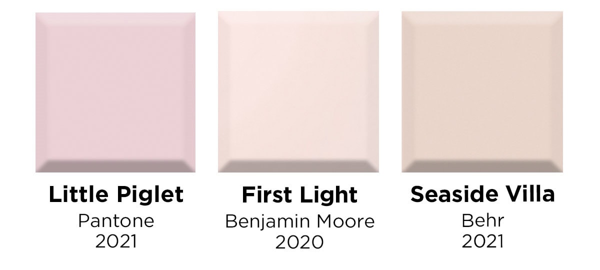
Pinks aren’t just for the nursery anymore — pale pinks up the sophistication in any space with an air of luxury and calm confidence.
Pantone’s Little Piglet, for instance, is a feminine shade that’s nevertheless too cosmopolitan to be called “girly.” First Light and Seaside Villa, on the other hand, are rosy alternatives to traditional white and beige, each expressing a restful variation from our expectations of conventional pink.
Juicy Clays
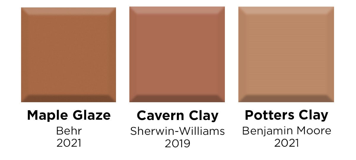
These juicy clays offer a refreshing option to typical earth tones.
Maple Glaze is as hopeful and welcoming as your favorite breakfast treat. Cavern Clay and Potters Clay are more subdued options, warmer than a typical beige while still providing an earthy ground to nature.
[Related: Back to Nature: Ceramic Tile in Earth Tones]
Soothing Grays

You may not think of gray as a color that offers a lot of variety, but these colors of the year prove just how different grays can be.
Pantone’s 2021 pick, Ultimate Gray, is a fortifying yet bright “rock” gray that pairs well with cheerful colors. A lighter gray, Benjamin Moore’s Metropolitan is a stylish shade that reflects the modern sophistication of 21st-century design and on the darker side of the spectrum, Barnwood Gray is a deeper, warmer gray with a “relaxed” impression.
Dressy Blues
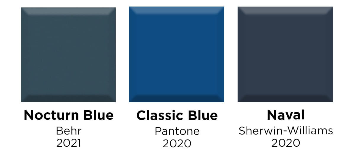
Blue has the reputation of being a traditional choice for interior decor. Dramatic aesthetics employ deeper colors to spotlight decor features and these dark blues carry a backdrop with more elegance than black.
Behr’s Nocturn Blue is a muted and refined shade that along with Sherwin-Williams’ Naval presents a new take on classic navy blue. Pantone’s Classic Blue is a more vivid blue that made a huge splash in 2020 by emanating the tranquility and restfulness of the sky at dusk.
[Related: Tile Trends We Love: Blue Backsplash Tile]
Beachy Blue-Greens
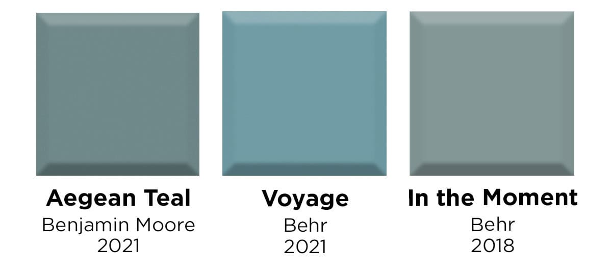
These nature-inspired blue-greens create a zen, soothing, and uplifting environment and are the perfect choice for beach house decor or any space you imagine with a coastal or peaceful effect.
Benjamin Moore’s Aegean Teal and Behr’s In the Moment are similar combinations of blue, green, and gray. Voyage, another color from Behr, is a brighter, bluer evolution of this restorative color.
Soft Blacks
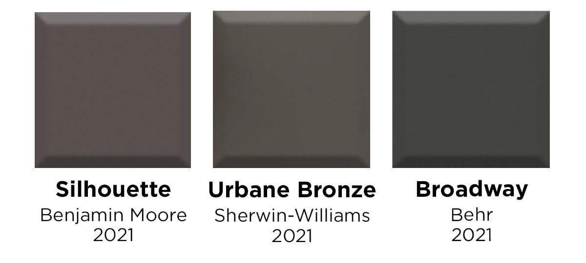
2021 has brought us three soft black shades from Benjamin Moore, Sherwin Williams, and Behr: Silhouette, Urbane Bronze, and Broadway, respectively. These shadowy shades offer refreshing alternatives to black without approaching gray.
The warmest of the options, Silhouette’s red undertones give it a sultry aspect that could make any room sumptuous and lush. Urbane Bronze has more brown undertones and a welcoming aesthetic, and would pair well with natural materials such as wood, stone, metal, and leather. Broadway is the darkest and most grounded of the three colors, imbuing safety and resilience.
[Related: Bewitching Black Bathroom Tile]
Biophilic Greens
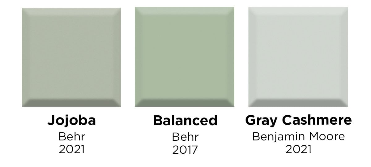
These biophilic greens come straight from nature on a spring morning, and are a great way to build a natural aesthetic in your home.
Behr’s Balanced (2017) and Jojoba (2021) are calm greens, with the 2021 pick a slightly more subdued version.
Gray Cashmere stands apart from the first two greens, as it’s the grayest of the bunch, but with a distinctive green undertone. Gray Cashmere is an excellent biophilic neutral to work with the resurgence of wood accents, cabinetry, and furniture we are witnessing.
Sunny Yellows
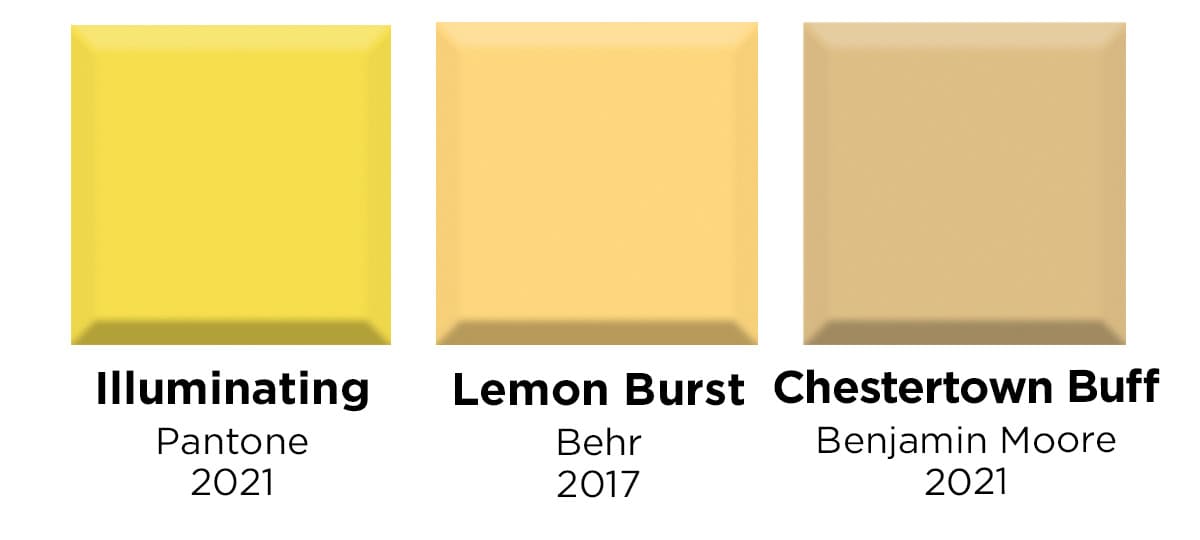
These color of the year choices show a full spectrum of yellows sure to give you a sunny disposition.
Benjamin Moore’s Chestertown Buff represents a popular muted beige-yellow with a gentle, earthy maize color that looks good in a wide range of spaces. Lemon Burst is decidedly brighter but still a muted sunny shade.
Pantone’s 2021 color of the year Illuminating breaks with previous common yellows, providing a purer tone. Some may even feel that Illuminating is too bright to be an “acceptable yellow” in interior decor, but we’ve found that it works well when contrasted with darker and more grounding colors, such as its co-color of the year, Ultimate Gray.
[Related: Tile Color Psychology: How Your Tile Color Affects Your Mood]
Find Your Tile Color
We were able to appreciate the individuality of each of these top picks in color, while also identifying color categories that keep bringing us joy. Keep exploring our Design Gallery and Pinterest boards for examples of tile in all of the above colors and more. And don’t forget about grout — our Grout Color Guide will help you choose the perfect shade of grout for your specific tile color and design.
We can’t wait to see what the next five years of colors bring!

