
Updated October 2026
—


Searching for a tile color for your space? With so many attractive tile colors and creative tile designs to choose from, settling on the perfect one can be a challenge.
The right tile color for you depends on many factors, including your personal aesthetic and the size of your space. Regardless, your first consideration should be the function of the room you plan on tiling. Different rooms have different needs, and a color that works for one room won’t necessarily be a great choice for another.
Whether you’re looking for creative tiles to add character or practical tile to complement your home’s overall look, consider both style and function.
To help get you started, we’ve created a room color inspiration guide with ideas for every room of the house.
[Related: Understanding Tile Color Psychology: How It Influences Your Mood]
Bathroom Tile Colors
Because of their (typically) smaller size, bathrooms present an opportunity to pack a creative punch with a great tile color.
So what are the best bathroom colors? Color experts at Martha Stewart say that these (among others) are perennially popular:
- Pale blues
- Moody greens
- Warm neutrals
- Earthy roses
- Chalk white
Of these colors, our favorites are pale blue, moody green, and chalk white.

Blue bathroom colors have long been favorites because they’re particularly refreshing. Popular options include cool, dusty blues with hints of gray and brighter blues reminiscent of water.

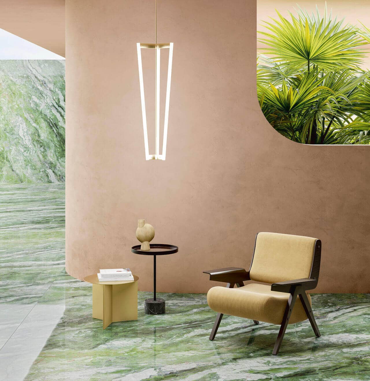
Moody green hues are the current go-to choice to create a statement bathroom look.
Rich, nature-inspired green tile offers the dual benefits of being bold and visually pleasing, making it an ideal tile choice for both style and impact.

White bathroom tile was popular in the Victorian era and hasn’t gone out of style, for good reason. Chalk-white tile creates a crisp and clean look, perfect for bathrooms.
If white tile isn’t for you but you still want to go with a neutral, you can’t go wrong with grays. Like white, grays let you change up your bathroom’s look with accent colors whenever you please. White and gray tile are also excellent options if you’re aiming for farmhouse chic.
[Related: Colorful Bathroom Floor Tile Ideas]
Bedroom Tile Colors
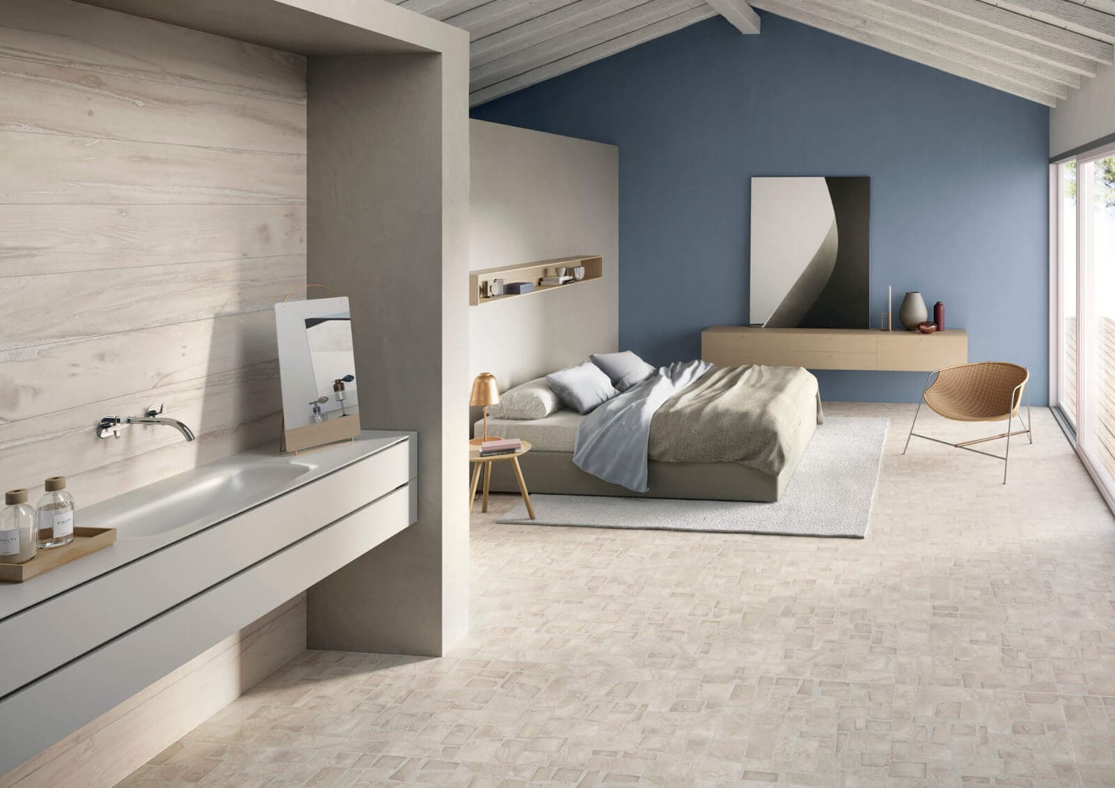
Bedroom colors are a highly personal choice because this space is entirely your own. The colors you choose should create a personal sanctuary.
Many people choose bedroom colors that promote sleep: blue, light pink, white, beige, and green. These shades help you feel relaxed and secure.
Dark colors are another bedroom option because they can create a cozy sleep cave. Bright hues, however, can be too energizing for a space you want to wind down in.
You might consider feng shui principles, which say the bedroom is most connected to your qi (or life force energy).
The best colors for good feng shui depend on what feelings you’d like to cultivate. For instance, you might choose these hues:
- Blue, green, or teal tile for vitality and wellness
- Purple tile for prosperity
- Peach and pink tile for romance
- White tile for simplicity
- Brown, orange, or earthy yellow tile for balance
- Navy and dark blue tile for spirituality
- Gray tile for support
- Black tile for wisdom

Many people gravitate toward neutral bedroom colors to let their furnishings and textures do the talking.
Neutral options are numerous, with many these days even sporting a touch of color.
Incorporating contemporary tile patterns into your bedroom design can also enhance feng shui. They add subtle movement and flow, guiding energy in a visually calming way.
If you’re looking for more inspiration, check out floor tile patterns to complete your bedroom’s look.

[Related: Colors of the Year 2026 and the Shades Shaping Tile Design]
Living Room Tile Colors
Your living room is your primary gathering and entertaining space, so you likely want to make a great impression. We’ve grouped living room tile options into three color categories:
- Neutral
- Mood-setting and dark
- Colorful and bright
Neutral living room favorites include white, gray, beige, blush, gray-green, brown, and black. We’re particularly excited about the more color-forward blush and gray-green.

When it comes to dark and moody color schemes, blues, blacks, deep greens, and dark wood looks make stunning backdrops for furnishings. Navy blue living rooms are timeless, and peacock palettes are posh.
Flooring, accent walls, and fireplace surrounds are all beautiful opportunities to incorporate ceramic tile into your living room. Choosing the ideal tile for these areas can enhance their overall aesthetic, adding texture, depth, and sophistication.

If you want bright, colorful tile to lend your space energy, consider yellows, pinks, light blues, greens, and teals.
[Related: Grout Color Guide: How to Choose the Right Grout Color for Your Tile]
Kitchen Tile Colors
Coordinating your tiled surfaces, appliances, cabinets, and paint colors can be a fun challenge. A few shades stand out as particularly chic.
Neutrals can give balance to vivid cabinets or appliances. Think white, beige, gray, or sage. Natural looks, like stone or wood, are also strong contenders.

Warm kitchen colors like yellows, oranges, and reds are cheerful options. You can certainly choose bright versions of each shade, but lighter, muted tones are also available, like amber, terracotta, and rich reds with brown undertones.
A relevant bonus: Orange and red are thought to stimulate appetite.

Blues never go out of style, and blue tile looks great with a wide range of cabinet colors. In fact, blue is one of the most popular kitchen backsplash shades.

[Related: Kitchen Floor Tile Ideas: Patterns & Designs Worth Standing On]
Open-Concept Space Tile Colors
Open-concept floor plans have long been beloved. Why? They create an expansive feeling and allow the whole family to congregate. You have additional considerations when choosing colors for these spaces.
Do you choose one color for the entire space or multiple colors?
Behr recommends choosing a harmonious color palette of three to five colors, including these:
- 1 white or light tone
- 1–2 neutral tones
- 1–2 supporting colors

You can use different colors to distinguish different zones within an open-concept space, such as the kitchen, dining, and living areas.
Earth tones are a great option for dining room floor tiles because they tend to coordinate well with one another.
When using multiple colors, try repeating each at least twice (in tile, textiles, or decor) to tie the space together.

[Related: Indoor-Outdoor Tile: Your Complete Guide]
Outdoor Tile Colors
Porches, patios, decks, and pool surrounds are valuable living spaces for any home. And they’re great opportunities to include striking ceramic tile.
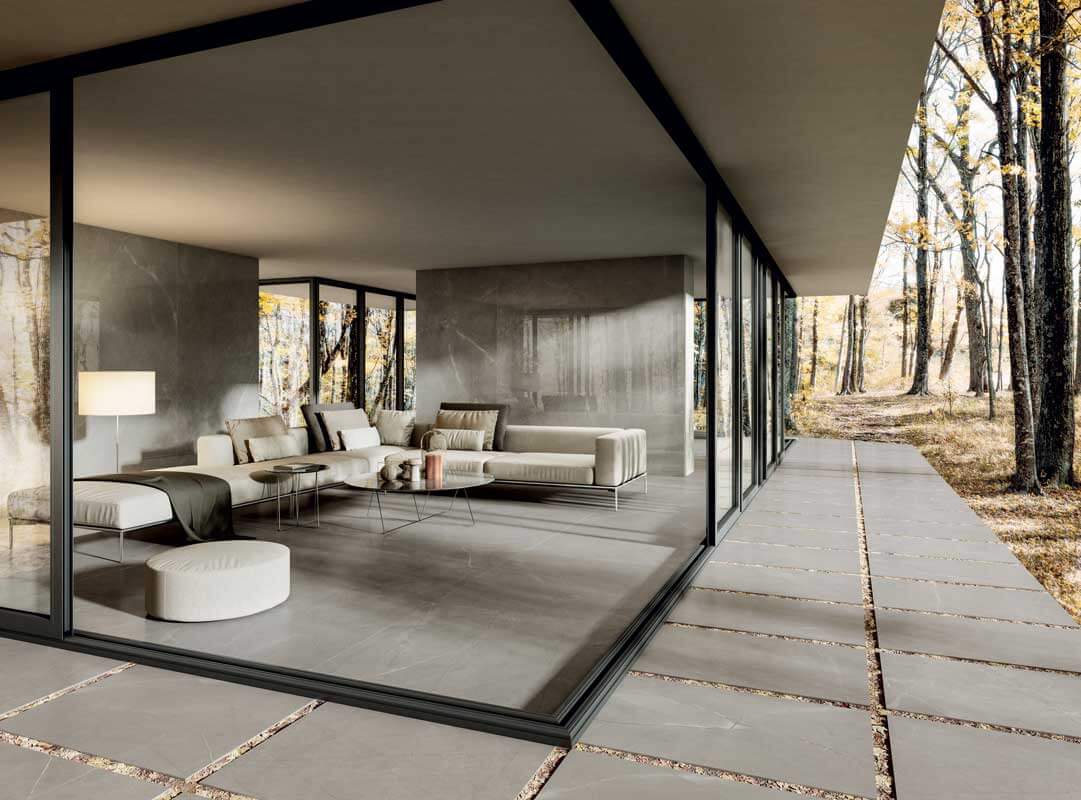
When choosing colors for an outdoor space, work with the existing palette of your home’s facade and natural surroundings. Earth tones are great for blending your space with the existing natural elements.
Creative tile designs can elevate your outdoor area, adding visual interest and personality while complementing the environment.

No use competing with the great outdoors. Neutral tones let Mother Nature take center stage. They’re also great foundations for water features, like pools, fountains, or ponds.

[Related: Your Guide to Tile for Outdoor Entertainment Spaces]
Dining Room Tile Colors
The dining room is a fabulous area to use a statement color, such as red, blue, brown, or black. These make a stunning design impact.

Bright dining room colors can also make a striking impression. Enduring options include sunny yellow, cantaloupe, bright blue, turquoise, and coral.
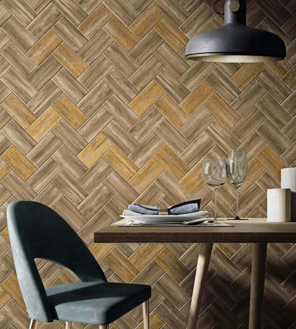
Dining rooms often sit just off a kitchen or living room, so their colors need to work with the adjoining spaces. Neutrals tend to best serve open floor plans, but that doesn’t mean you can’t incorporate color.
The Spruce recommends greige as the “best neutral” for dining rooms, noting soft greens and pinks as timeless options.

[Related: Guide to Tile for “Third Spaces”: Meet, Work, and Play]
Laundry Room Tile Colors
The laundry room may be a utility room by design, but that doesn’t mean it has to have a utilitarian look. Adding ceramic tile to your laundry room can both protect your surfaces and lend your space style.
The Spruce recommends a laundry list of options to create the optimal vibe, from soothing tans to fresh blues to poppy pinks and lavender.
What helps you complete the task: clean and soothing or polished and energized? Opt for warm white over stark, sterile whites. The tone adds warmth while maintaining a clean look.

Beige tile complements a wide range of accent colors. That’s particularly relevant if your laundry room can be seen from other parts of the house.

Pink tile adds personality to small laundry rooms. Softer pinks can create a vintage look, while brighter pinks and corals pack more of a punch.

[Related: Pretty Pastels: Tile in Pastel Tones]
Tile Colors for Any Room
Here are a few more color ideas that work anywhere in your home.
Colors From Nature
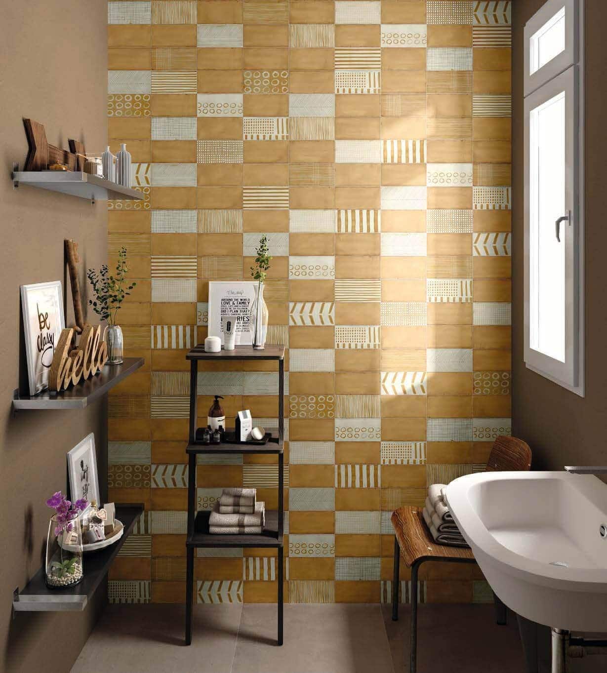
Nature-inspired colors are enduringly elegant as part of the biophilic design trend.
Incorporating natural palettes and earthy elements into your home can improve well-being by fulfilling an inherent need to connect with nature.
Nature-inspired colors include earth tones such as greens, browns, reds, as well as oceanic colors like teal, turquoise, or aqua.
[Related: Back to Nature: Ceramic Tile in Earth Tones]
Colors That Spark Creativity

A study by the University of British Columbia found that blue opens people’s minds to new ideas and promotes trust, communication, and efficiency. And those are all important elements of creative inspiration.
In a University of Munich study, green spurred innovation by promoting balance and harmony.
Colors that inspire creativity are also deeply rooted in personal aesthetics. So if purple is your favorite color, it may spark your imagination.
[Related: 2026 Tile Trends: Artisan Aesthetic]
Colors That Make Rooms Look Bigger

When decorating a small apartment or home, you may want to choose tile in colors that make rooms look bigger.
This is especially true for floor tile because the color you choose has an outsized effect on how spacious a room feels. These are some of the best colors for creating a spacious look:
[Related: Small Space Tile Ideas: Colors, Layouts & Design Tips]
Why Tile Works in Every Room
Color is only half the equation: The material itself is just as important. Ceramic and porcelain tile bring practical advantages that make them smart choices, no matter their color:
- Ease of cleaning. Tile wipes clean with water, with a pH-neutral solution for tougher messes. That’s one reason it’s favored in kitchens, bathrooms, and mudrooms.
- Moisture resistance. Tile won’t warp or swell the way some flooring materials do. It suits bathrooms, laundry rooms, and kitchens beautifully.
- Hygiene. Tile is nonporous and doesn’t trap allergens, dust, or bacteria, making it easy to keep truly clean.
- Durability. A well-installed tile floor can last decades with minimal upkeep, standing up to heavy foot traffic, pets, and daily wear.
- Fire resistance. Ceramic tile won’t ignite, melt, or release toxic fumes when it meets heat or flame.
- Design flexibility. Because tile comes in unlimited colors, finishes, and textures, you’re never locked into one look. Fancy a lavender wood-look tile in your home office? (Oh yes, it exists.)
That function-meets-flexibility combination is what makes tile the smart choice for any surface, regardless of color.
[Related: Low-Maintenance Benefits of Ceramic and Porcelain Tile]
Tile Color FAQ
Have more questions about choosing the right tile color? Here are answers to some of the most common ones we hear at Why Tile.
What’s the most popular tile color right now?
Neutral tones (soft whites, warm beiges, greiges) are the most universal tile colors because they adapt to changing decor trends. That said, bolder hues (greens, reds, blues) have surged in bathrooms and kitchens as homeowners crave character.
How do I choose a tile color for a small room?
Lighter tile colors tend to make small rooms feel open, especially on the floor. If you want color without visually shrinking the space, keep contrast low between your tile and walls.
Should tile color match throughout my house?
Not necessarily. Many homeowners use a neutral base tile in connected spaces (like an open-concept kitchen and living room). They reserve bolder colors for self-contained rooms like powder rooms or laundry rooms. Tile coursing is a fun way to add strokes of color.
Do trendy tile colors go out of style quickly?
“Busy” color mixes can date a space faster than neutrals, but go with your gut if you want to love your space. A good middle ground is choosing a trending color for an easily updated space (backsplash, accent wall) rather than a full floor.
What tile color adds the most resale value?
Neutral, timeless colors (white, gray, beige) are generally the safest choices for resale. They appeal to the widest range of buyers and pair with any decor. Then again, each room can carry its own price, color, and flavor.
[Related: Tile Buying Guide]
Let Your Colors Shine in Porcelain and Ceramic Tile
Whichever room you’re designing, we hope you’ve found the perfect tile color. For more inspiration across the color spectrum, check out our design gallery.